So, I've been talking with Quintin about the site design with some ideas I had, and we talked about it and agree that changing how the site looks is definitely a good thing. There are a few disagreements between the two of us about what the focuses on the main page should be and where things should go, so let's get some other thoughts.
(note there are a few differences that I don't mention, like the header differences - that's because there's no disagreement there: they were just changed in between the two versions)
Here's the first layout design:
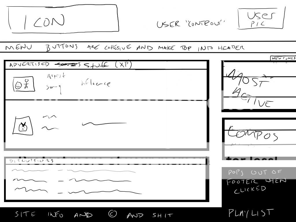
Summary:
-Songs advertised through experience are featured in the center of the page.
-Most Active and New Songs merged into one table, switchable by tab.
-Competitions gets its own table below new songs.
-News merged with discussion (logic: Announcements will be made on the forums anyway, so why the redundancy?)
And here's the second layout design:
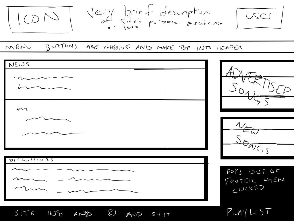
Summary:
-News front and center, competitions included, instead of merged with discussion. (logic: Doubt that casual visitors will visit the forums for news)
-Advertised songs in the top right
-New songs in the bottom right
-Most Active songs removed due to probable redundancy with Advertised Songs
So what are y'alls' thoughts on the two layouts? What do you like about either? Any other suggestions?